


THE INTERGENERATIONAL REPORT: A LITTLE MORE ACTION?
Rigorous, impartial, useful ... but it's important to remember what it isn't and think about what it could become

(TL;DR The Intergenerational Report analysis remains a pillar of good governance, but we could be better served by more regular and flexible data releases)
The IGR is sometimes referred to as a blueprint for Australia’s economic future. That perhaps overplays the breadth of the work — there are no design specs released for education, health, or industry policy. That’s not its role. Perhaps a better way to think is that it provides a bedrock set of fiscal projections which those sorts of policy discussions can start from.
But even that is to exaggerate. The IGR is not a set of forecasts. As with all IGRs dating back to 2002 it is heavily driven by assumptions. Some components, such as labour force participation and government outlays on aged care, appear to be based on detailed microdata models and no doubt are at least as good as anyone in the country could produce. But, in other areas, assumptions that profoundly affect the outcomes — the terms of trade, migration, unemployment, productivity — appear to have been merely chosen.
This may be a necessary evil, though as I discuss in summing up there are other options.
The assumptions chosen may well be defensible, but they are not well defended in the document itself.
This post sets out a few of the policy-relevant curios not explored well in the IGR. Charts and quotes are clipped from the 2023 IGR except where alternative sources are noted.
So let’s get into it.
A BRIEF HISTORY OF THE NEXT 40 YEARS IN 5 CHARTS
I won’t attempt to distil all of the wisdom in the IGR here, but rather present enough information for the reader to understand my discussion of assumptions below. A good and broad visual summary of the IGR’s findings is available here, which also compares projections with those of previous IGRs.
Average living standards — as measured by Gross National Income per person, the best measure available in the national accounts — are projected to grow about 1% per year … a rate that is lower than Australians have experienced since the Great Depression. This contrasts with the 1980s when an expansion in employment drove incomes higher, the 1990s when a wave of productivity improvements drove incomes higher, and the Noughties when the terms of trade drove incomes higher.

Commonwealth Government spending (‘payments’), absent policy change, is set to outpace growth in tax receipts.

The main drivers of increased spending are aged care, health care and the NDIS. By contrast, Commonwealth Government spending on education is projected to fall from 1.7% of GDP today to 1.2% of GDP in 2062-63 … see my post on teacher wages.
COMPONENTS OF COMMONWEALTH GOVERNMENT SPENDING
Per cent of GDP

Source: 1hand calculations based on 2023 Intergenerational Report
It’s worth pausing for a moment on the NDIS. The IGR projects it to grow to be almost as large as all major payments to households combined.
SELECTED COMPONENTS OF COMMONWEALTH GOVERNMENT SPENDING
2022-23 $ per head of the Australian population

Source: 1hand calculations based on 2023 Intergenerational Report
This is because average payments for services under the NDIS per person vastly exceed any other welfare payment. The average NDIS recipient recieves in-kind support that is almost equal in value to the after-tax wage of a competent and qualified soldier, police officer or teacher: every additional NDIS recipient is one less teacher in your kids’ classrooms, one less police officer on the beat, or one less soldier manning the battlements. So when the number of NDIS recipients increases, the hit to the public purse is profound. Sometimes when we try to correct chronic underspending, it results in overspending.
WELFARE PAYMENTS AND PUBLIC SECTOR WAGES, c.f. NDIS
2021-22 $
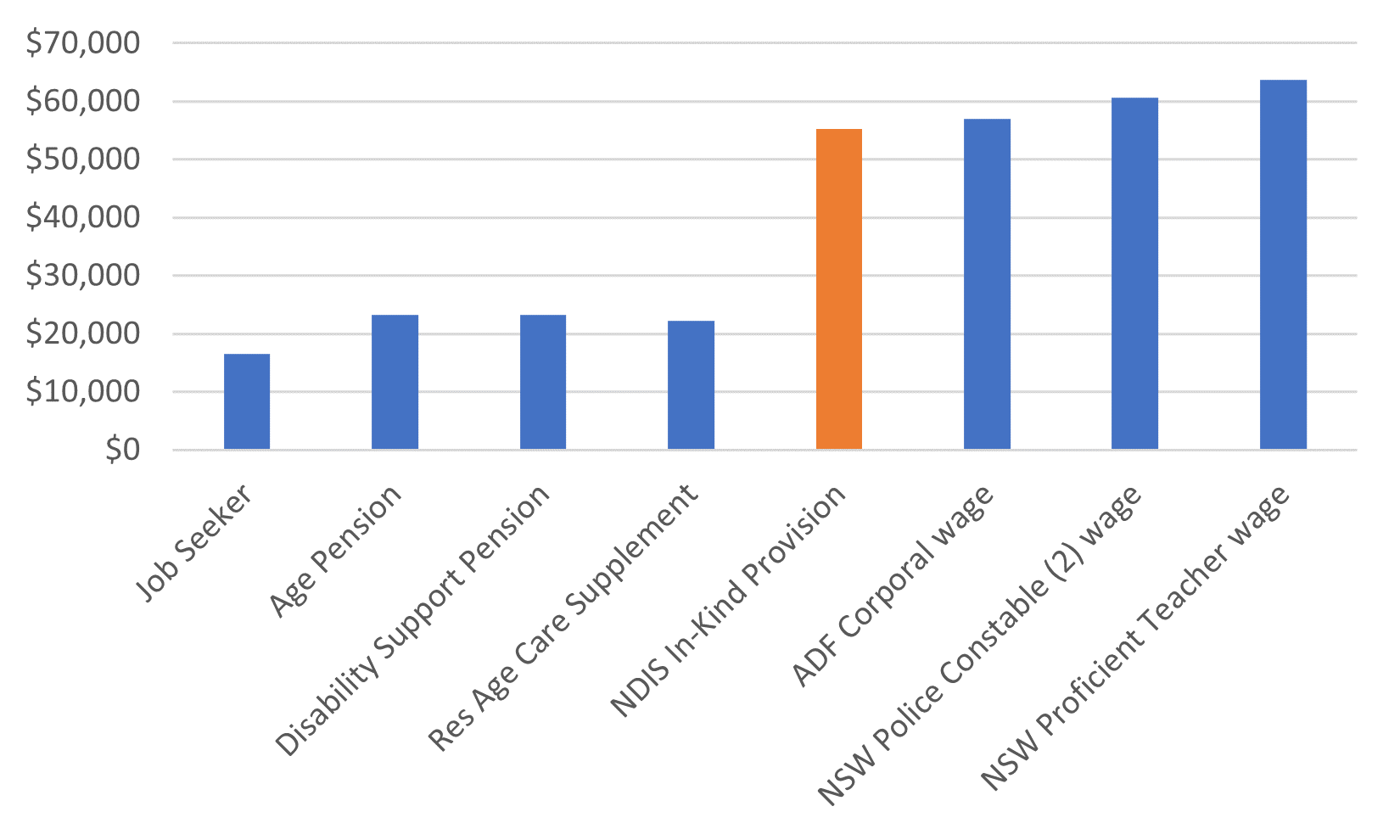
Source: 1hand calculations based on 2023 Intergenerational Report, Department of Health and Aged Care, ADF, NSW Police, NSW Department of Education. Chart shows maximum rates for transfer recipients, minimum wages at level after tax for workers and average NDIS support per recipient.
On to those niggly assumptions…
TERMS OF TRADE
The terms of trade are the ratio of Australian export prices to Australian import prices. If our export prices go up, we win in terms of the purchasing power of our incomes. Yay! If our import prices go up, we lose. Boo!
Through most of Australia’s history it has been a pretty boring data series. Between 1959 and 2003 it moved not one jittery-jot. Understandably, and ironically, the concept didn’t even get a guernsey in Peter Costello’s inaugural 2002 IGR.
AUSTRALIA’S TERMS OF TRADE SINCE 1959
Index, 2020-21 = 100
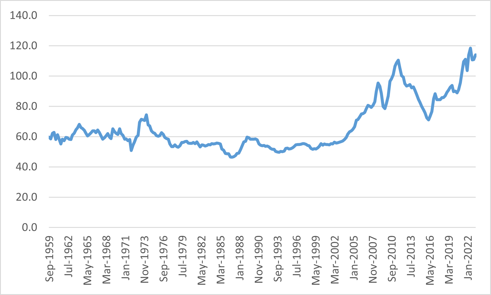
Source: 1hand calculations based on ABS 5206.0.
But we live in more interesting times. The terms of trade are projected to fall in the near term and then stabilise.
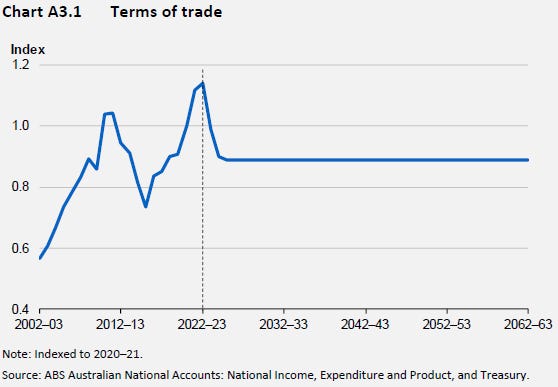
The IGR explains:
The framework in Treasury’s 2014 long-run forecasts of Australia’s terms of trade working paper was used to illustrate demand for Australia’s thermal coal exports over the next 40 years.
The analysis in that paper maps a cost curve for thermal coal producers.
Water has passed under bridges since 2014.
In the near term, it would appear there is a recession (or similar) in China so severe that officials have suspended publication of consumer sentiment surveys and youth unemployment numbers.
In the longer term, one might reasonably assume that if the climate change disaster set out in Chapter 5 of the IGR is to be averted then at some time before 2062-63 the price of thermal coal exports needs to fall, and fall, and fall, and fall some more until every last thermal coal mine in the country has shut down and demand for Australian thermal coal is essentially zero.
The terms of trade at some point may reduce below the elevated March 2020 level that is assumed to persist for 40 years.
MIGRATION
Australia is probably the most successful multi-cultural country.
A double-edged observation. While I am very proud of being a part of such an honest, accepting, unprejudiced society, I sometimes worry that we don’t really know why it has worked so well here. Regardless …
When the first IGR was launched back in 2002, the main pitch was that demography doesn’t need to be destiny. Policy changes can raise labour force participation and productivity to deliver strong economic growth despite the ageing of the population. While migration was a lever available to governments, there was an understanding that it does not eliminate the fiscal pressures of an ageing society due to health and aged care and so forth (Gary Banks 2010), but merely delays those pressures because, it turns out, migrants age too. Such was the wisdom of the time.
Nevertheless, instead of raising productivity (which generally requires upsetting vested interests) or raising labour force participation (let’s face it, jobs ain’t nothing but work, right?), the main lever that has been pulled is population.
Migration assumptions have risen from a constant 90,000 people per year for 40 years in the 2002 IGR to a constant 235,000 people per year for 40 years. To misquote Paul Keating, we ‘flicked the switch to vaudeville’.
So, what does migration do for Australians?
The IGR purports to answer this question. The average skilled migrant contributes between $292,000 and $442,000 to the Commonwealth Budget net of all health costs and so forth over the course of their life in Australia. As the chart shows, bringing in poorly skilled migrants creates a net financial loss to the Commonwealth Budget. Skilled migrants pay taxes that in turn pay for health care and aged care of older Australians.

But presumably the intent of successive Commonwealth Governments is mainly to improve the wellbeing of the Australian people rather than to merely raise taxes? On whom does the economic benefit of migration fall? And who loses?
Let’s say we bring in one additional foreign university student intending to migrate permanently.
Universities flex and there is no loss of a place for an Australian student. But when the Australian student comes to graduate they now face stiffer competition in the graduate job market. At the margin, some Australian may miss out on a promising career path. With greater business dynamism there would be proportionally more employers, but there isn’t greater dynamism and so there aren’t more jobs.
Meanwhile, owners of existing businesses now have a slightly larger market to sell to and benefit because they can raise prices slightly. With greater dynamism in the economy and stronger competition from startup businesses they would not be able to raise prices, but there isn’t greater dynamism and so they can raise prices.
Existing homeowners benefit because there is one additional potential buyer so they can raise their sale prices slightly. With better planning and zoning regulation they would not be able to raise house prices much, but there isn’t and they can.
Migration has been good for Australia in many different ways. But because of the regulatory impediments, the economic impact falls unevenly across the community.
The owners of fixed factors benefit in the medium term (business owners, as profits) and in the long term (land owners, through house prices).
Young Australians generally do not benefit from migration. While the burden of future taxes to pay for older Australians may be spread more widely, they find the increased competition for work to make it slightly harder to start climbing the career ladder, higher consumer prices irksome, and higher housing prices debilitating.
The IGR doesn’t smell like teen spirit.
Nor does the media. In the past few months, some media attention has been given to rising consumer prices including linking it to higher business profit margins. Some attention has also been given to rising rents. Little or no attention has been given to the highest migration rates in the history of the country which are behind both higher corporate profit margins and higher rents.
UNEMPLOYMENT
The IGR projects unemployment based on a non-accelerating inflation rate of unemployment (‘NAIRU’).
It isn’t a fair projection of the average unemployment rate over 40 years. One could reasonably assume that the unemployment rate could rise by up to 8 percentage points during recessions, and fall by maybe 1 percentage point during booms compared with a constant NAIRU. And that is assuming the NAIRU itself will remain constant and that we never again experience the hysteresis we did through the 1980s and 1990s.
The projected average unemployment rate over 40 years has to be significantly higher than the NAIRU.
Six per cent would be a decent starting point.
SUMMING UP
The 2023 IGR is a useful set of numbers and publication of future data remains a pillar of good governance.
Labor’s move to a three-yearly, mid-Parliamentary term cycle makes sense. It ideally should be an apolitical document that lands at a time outside of election cycles and provides a common starting point for policy debate on Australia’s long-term challenges.
In a couple of areas (unemployment, terms of trade) analysis that is fit for producing four-year budget forecasts has been used that is irrelevant and misleading for 40 year projections. In particular, I can’t imagine anyone putting their money behind the long-term commodity price forecasts. These are minor squibbles.
But …
The paper itself lacks an audience.
The pointy-heads can’t find the articulation of the reasons for making key assumptions, nor any measure of the uncertainty around them.
The chattering class watched the Treasurer’s Press Club Address instead.
The data is the diamond. Nobody else in the country can produce such a well-founded and consistent set of data that relate to the future of the Australian population and economy.
It isn’t 2002.
I have two suggestions for future IGRs.
Isn’t there an app for that?
Give users a sandbox where they can change the variables to suit their own forecasts.
There are a half a dozen or so key assumptions: net overseas migration, fertility, productivity, unemployment, labour force participation, terms of trade, mortality … that most of the key figures hang off.
Instead of telling us what will be — and inevitably you will be wrong every time — a choose your own adventure platform would better facilitate policy debate.
We, the people, are paying for the IGR to be produced. Give us a tool we can use.
Keep the app live
Keep the main models up to date with annual updates of Government policy as presented in Budgets. The IGR paper to become a chapter in BP1.
Treasury could overhaul the models every 3 years in line with the Government’s cycle, but update the data within existing models every year in May.
Here we are now, entertain us.